👋 Introduction
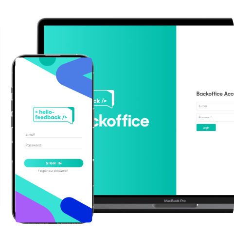
This platform is the backoffice of the App HelloFeedback, an app used in enterprise environments to rate colleague’s values, such as proactivity, engagement and other assets. With this product, users are able to obtain analytics, manage access and define settings that will ensure the critically constructive communication between colleagues in the workplace, based on their experience, skills and teamwork abilities.
This platform is the backoffice of the App HelloFeedback, an app used in enterprise environments to rate colleague’s values, such as proactivity, engagement and other assets. With this product, users are able to obtain analytics, manage access and define settings that will ensure the critically constructive communication between colleagues in the workplace, based on their experience, skills and teamwork abilities.
My Role
Responsible for research, conceptualisation, design and delivery of key modules and required features.
Responsible for research, conceptualisation, design and delivery of key modules and required features.
The Team
Me as Product UI UX Designer, 1 Project Manager, 3 Developers
Me as Product UI UX Designer, 1 Project Manager, 3 Developers
The Client
Mercer Consulting
Mercer Consulting
Timeline
Aug 2023 - Oct 2023
Aug 2023 - Oct 2023
😱 Problem Statement
Mercer Staff users found multiple issues when trying to succeffully complete their tasks within the backoffice Platform.
Mercer Staff users found multiple issues when trying to succeffully complete their tasks within the backoffice Platform.
🔑 Design Process
Starting by breaking down the briefing for the project, the research consisted in 1x1 interviews with 2 types of users - staff and managers, followed by the analysis of the collected data and supporting outputs.
Starting by breaking down the briefing for the project, the research consisted in 1x1 interviews with 2 types of users - staff and managers, followed by the analysis of the collected data and supporting outputs.

🤔 Breaking down the problem
Problem Statement
When logging into the platform, the users felt lost when trying to find the data that they required to succefully complete their task. How can we define a structure that highlights the main points of access while maintaining the sustainable integrity of the product?
When logging into the platform, the users felt lost when trying to find the data that they required to succefully complete their task. How can we define a structure that highlights the main points of access while maintaining the sustainable integrity of the product?
Research Methodology
In the first stage of research, while being interviewed, users shared their main tasks and goals within the platform and what frustrations they carried throughout. As a follow up, a survey that featured a ranking system detailed a series of actions that were currently performed in the platfotm. This survey was submited and shared with the users and external stakeholders so that the main actions could be prioritised and later analysed through user flows.
In the first stage of research, while being interviewed, users shared their main tasks and goals within the platform and what frustrations they carried throughout. As a follow up, a survey that featured a ranking system detailed a series of actions that were currently performed in the platfotm. This survey was submited and shared with the users and external stakeholders so that the main actions could be prioritised and later analysed through user flows.
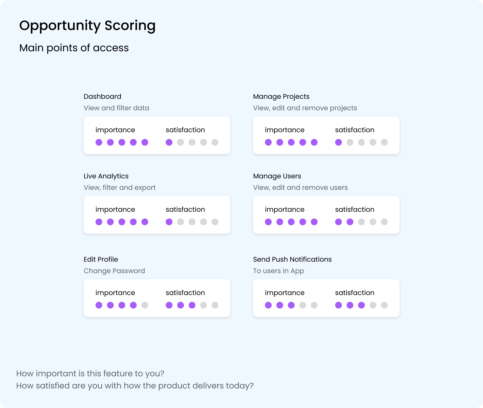
Opportunity Scoring | Main Accesses
The complete survey detailed each action that was available within these accesses, which allowed the proritisation of actions, later adapted into user stories with technical requirements and further specifications.
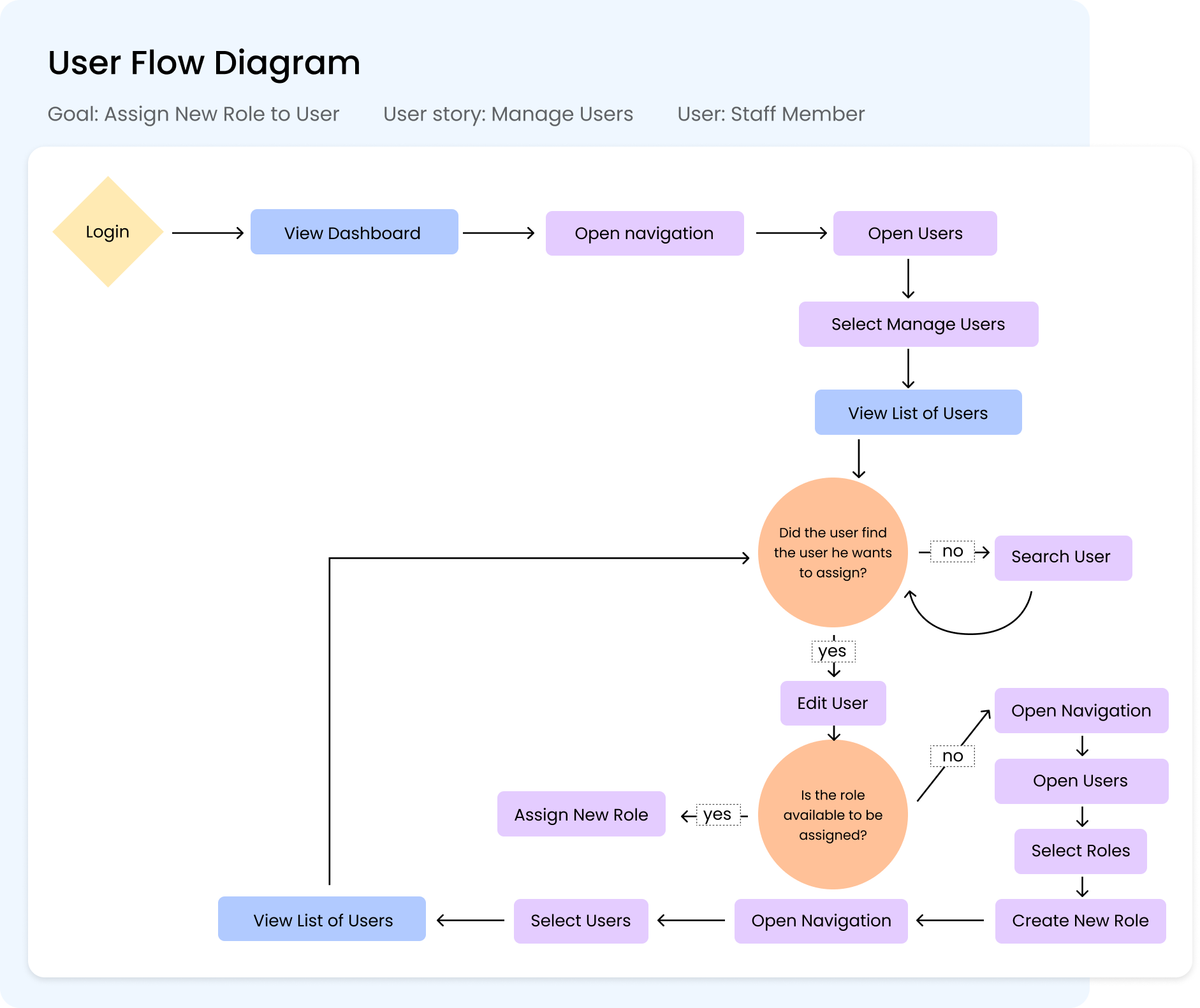 User Flow Diagram | Assign New Role
In the mapped user flow, used as an example, we were able to detect where redundant actions could be occurring. This led to the need to analyse the user’s journey in detail.
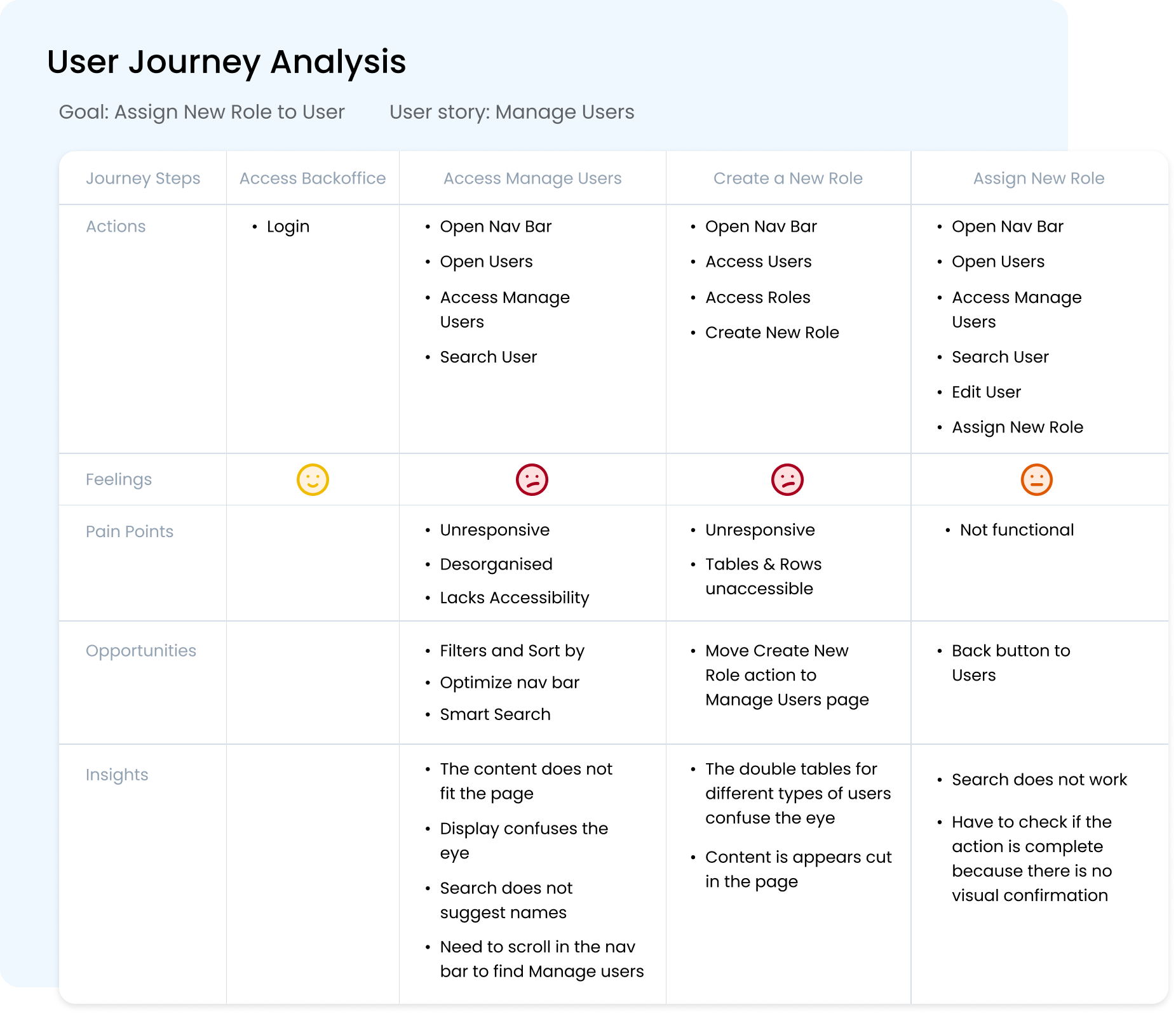
User Journey | Assign New Role
In the mapped user journey, we consider the feelings, pains, opportunities and insights that occur during the process. This exercise was repeated for actions that carried frustrations for the users within the platform.
 Product Map | Navigation System
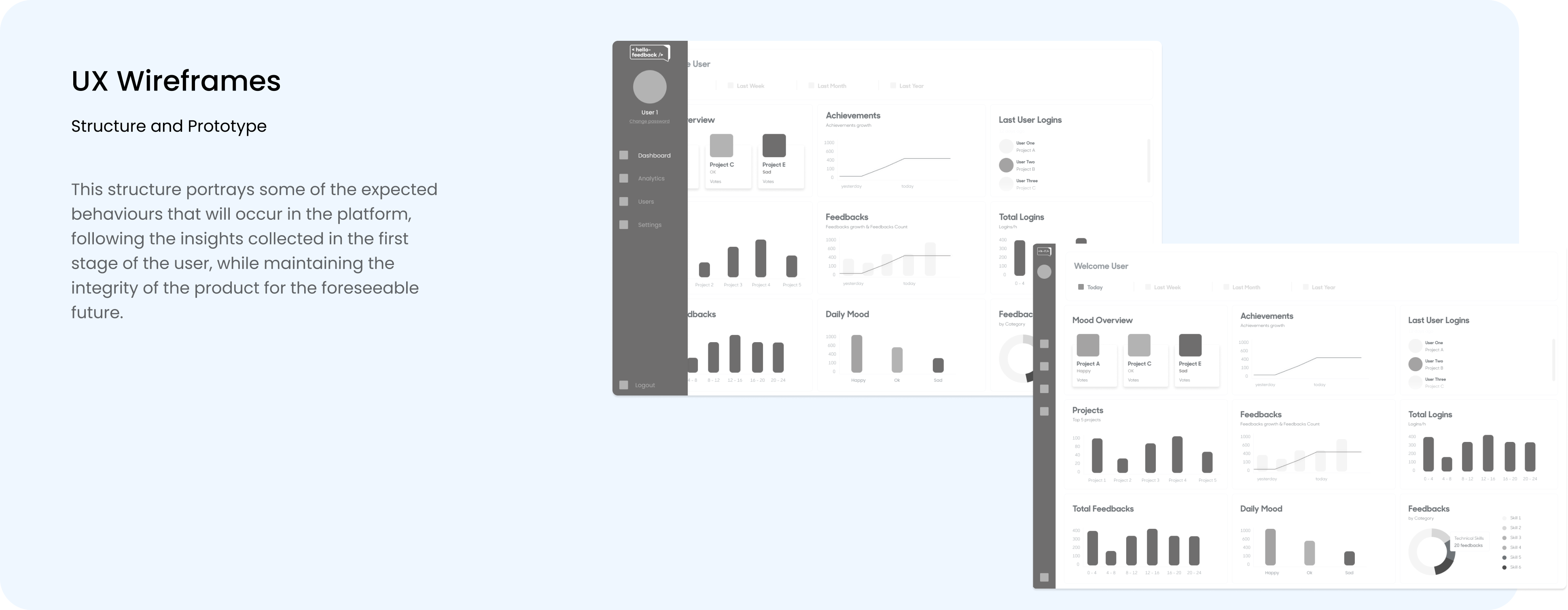
To create the structure for the navigation system, we constructed an hierarchy that translated the main points and the actions that were discovered to be the most valuable for users within each category.
What we learned
After sharing the UX structure prototypes with the users and external stakeholders, the feedback that was gathered revealed an improvement in the navigation within the platform, with most of the users showing the ability to finish their tasks without requiring any guidance or feeling doubt during the process. For the next stages of the design process, some small changes were expected in the structure of the platform as the requirements were revised for the second stage of the project, considering the sustainability and consistency of the product family as a priority.
After sharing the UX structure prototypes with the users and external stakeholders, the feedback that was gathered revealed an improvement in the navigation within the platform, with most of the users showing the ability to finish their tasks without requiring any guidance or feeling doubt during the process. For the next stages of the design process, some small changes were expected in the structure of the platform as the requirements were revised for the second stage of the project, considering the sustainability and consistency of the product family as a priority.
Data Visualisation | Accessibility
Problem Statement
Live Analytics concerning the actions that took place by the users on the app Hello Feedback were recognised as one of the main action on the platform, being prioritised by all types of users. However, the readability of such data was compromised on the current UI. How can we clearly highlight this valuable data and make it accessible to all types of users?
Live Analytics concerning the actions that took place by the users on the app Hello Feedback were recognised as one of the main action on the platform, being prioritised by all types of users. However, the readability of such data was compromised on the current UI. How can we clearly highlight this valuable data and make it accessible to all types of users?
Research Methodology
Through the collected insights from the users and the analysis of the overall experience within the platform, the next stage of the design process consisted in the redesign of the data components according to the user’s needs. Data visualisation can be expressed in different formats, per example, charts are a common way of expressing data, as they depict different data varieties and allow data comparison. In each method, application of color accents, iconography and other types of accents allow the data points to be recognised by the users instantly, making the information easier to process.
Through the collected insights from the users and the analysis of the overall experience within the platform, the next stage of the design process consisted in the redesign of the data components according to the user’s needs. Data visualisation can be expressed in different formats, per example, charts are a common way of expressing data, as they depict different data varieties and allow data comparison. In each method, application of color accents, iconography and other types of accents allow the data points to be recognised by the users instantly, making the information easier to process.

Previous Data Visualisation | Main Dashboard
For the correct implementation of each method of visualisation, it’s imperative to consider the accuracy and helpfulness of the data in display, carefuly choosing which method can sustainably showcase the necessary information to the users.
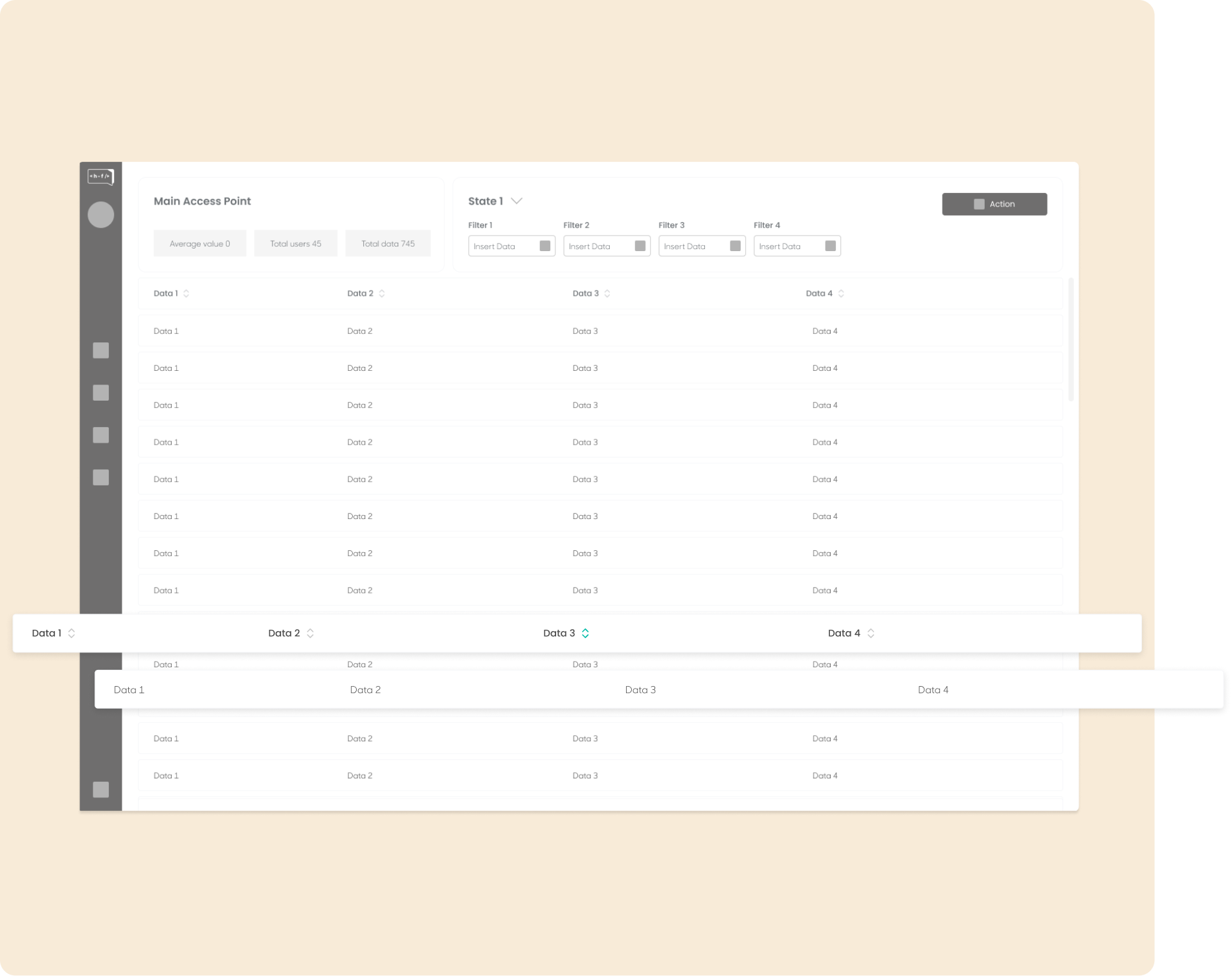
Tables visualisation | Wireframes
Tables were re-constructed to be responsive, readable, sortable and functional. The search engine was also optimised so that would offer recommendations based on the input - smart search.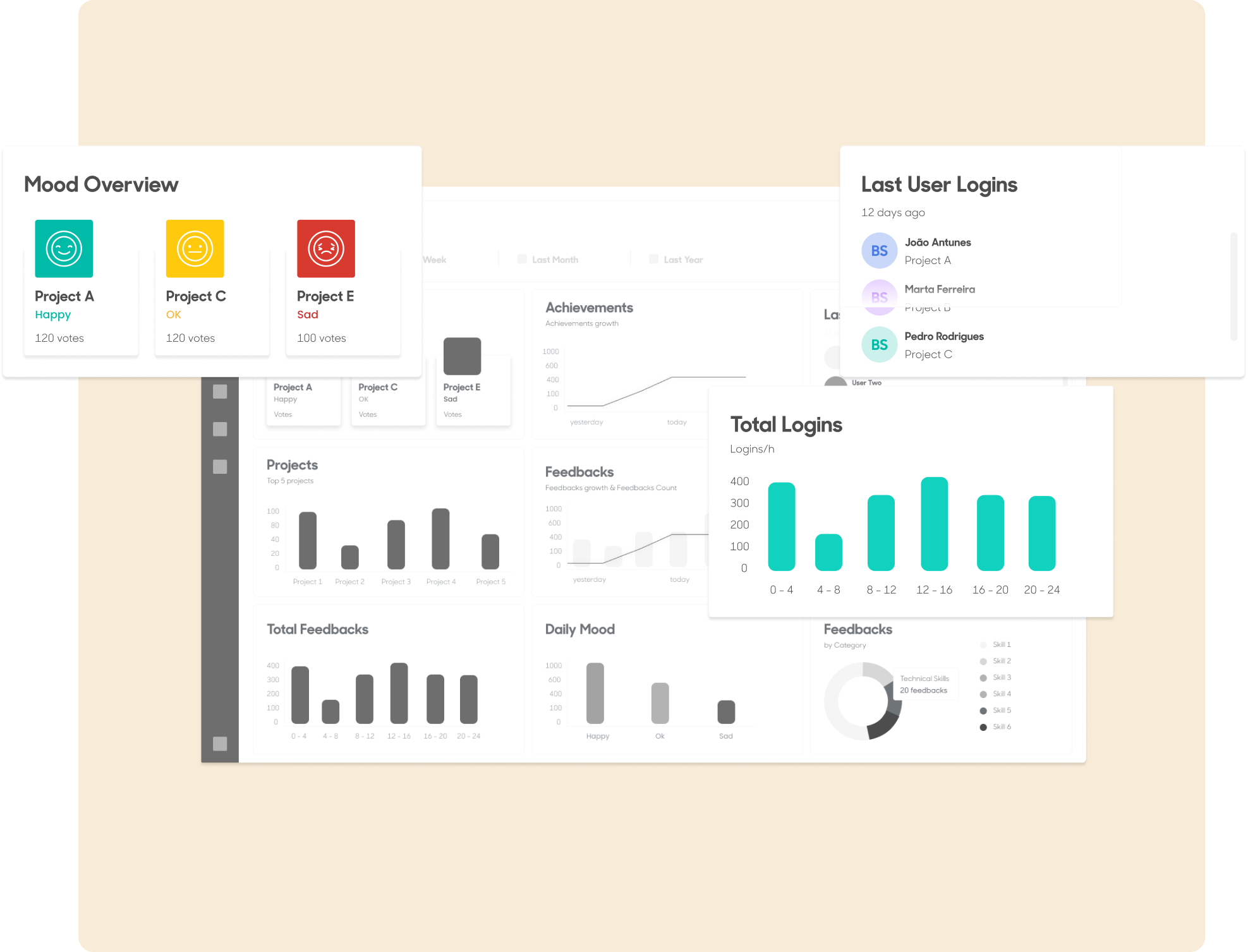
Graphs & Lists | Structure & UI
For graphs, the different methods of data visualisation were reconsidered, as in type of data and chart. Lists were also improved to increase their readability and overall accessibility.

Data Visualisation | Progressive Disclosure
What we learned
As we considered the scalability of the data, anticipating user needs on data depth, complexity, and visualisation on different devices, the components that were previously created for the platform suffered a 360º approach, adapting each point of data access to the type of data visualisation that would correctly and effectively communicate the desired information, considering their visibility, methodology and behaviour.
As we considered the scalability of the data, anticipating user needs on data depth, complexity, and visualisation on different devices, the components that were previously created for the platform suffered a 360º approach, adapting each point of data access to the type of data visualisation that would correctly and effectively communicate the desired information, considering their visibility, methodology and behaviour.
UI Consistency | Aesthetic
Context
The App Hello Feedback was designed in 2022, featuring design elements and colour schemes that were only applied to the app itself. When developing the Backoffice platform, a style sheet was designed so that both products subsist as one, by not only sharing data but a design system.
The App Hello Feedback was designed in 2022, featuring design elements and colour schemes that were only applied to the app itself. When developing the Backoffice platform, a style sheet was designed so that both products subsist as one, by not only sharing data but a design system.
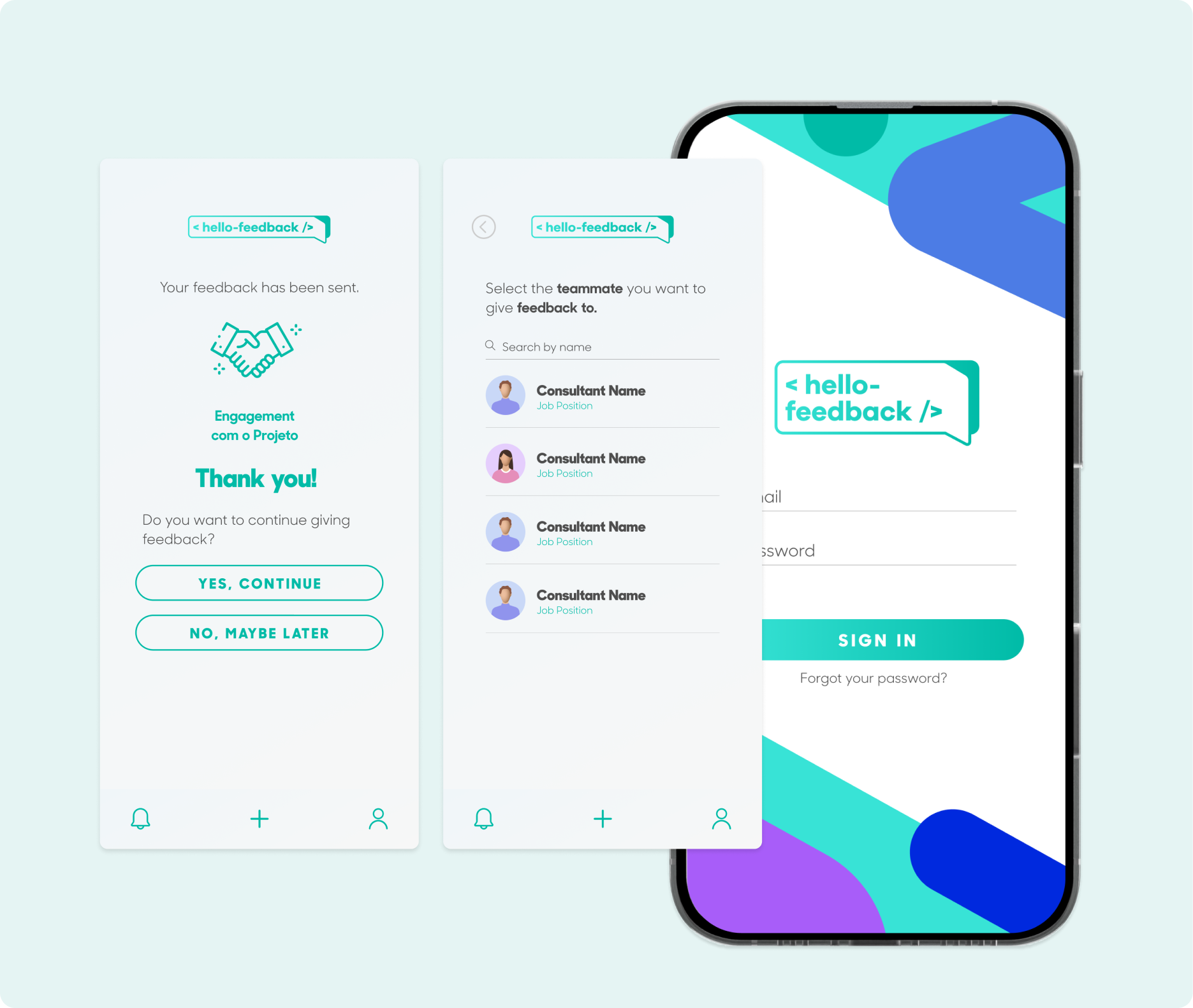
Hello Feedback App | Main App
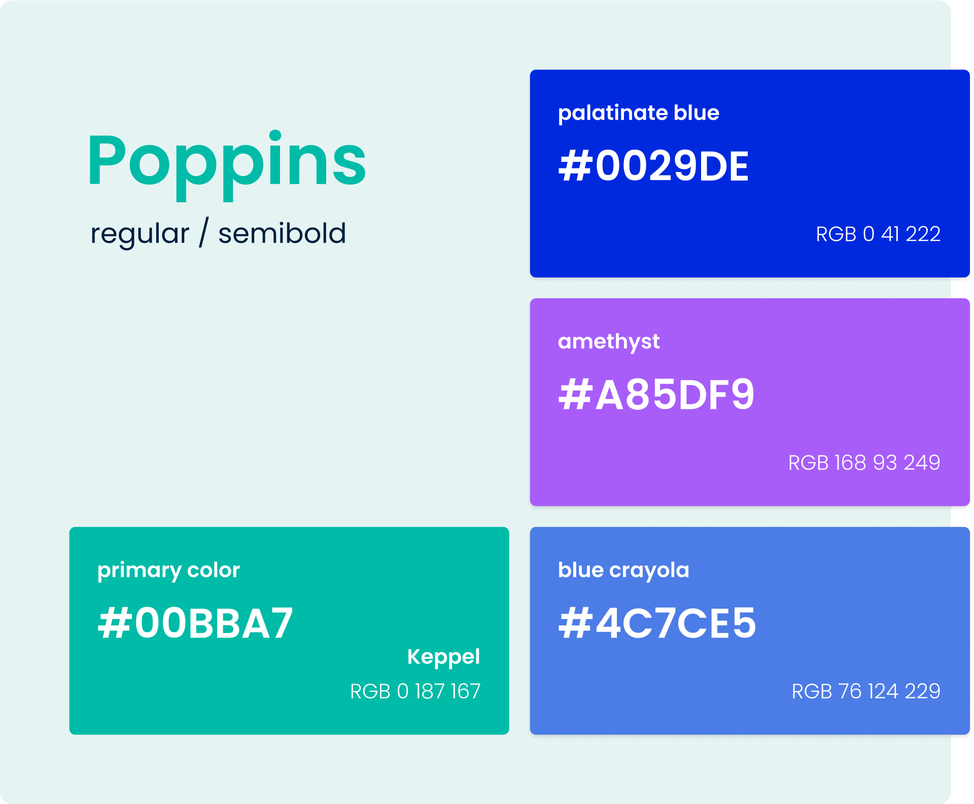
Hello Feedback | Style Sheet
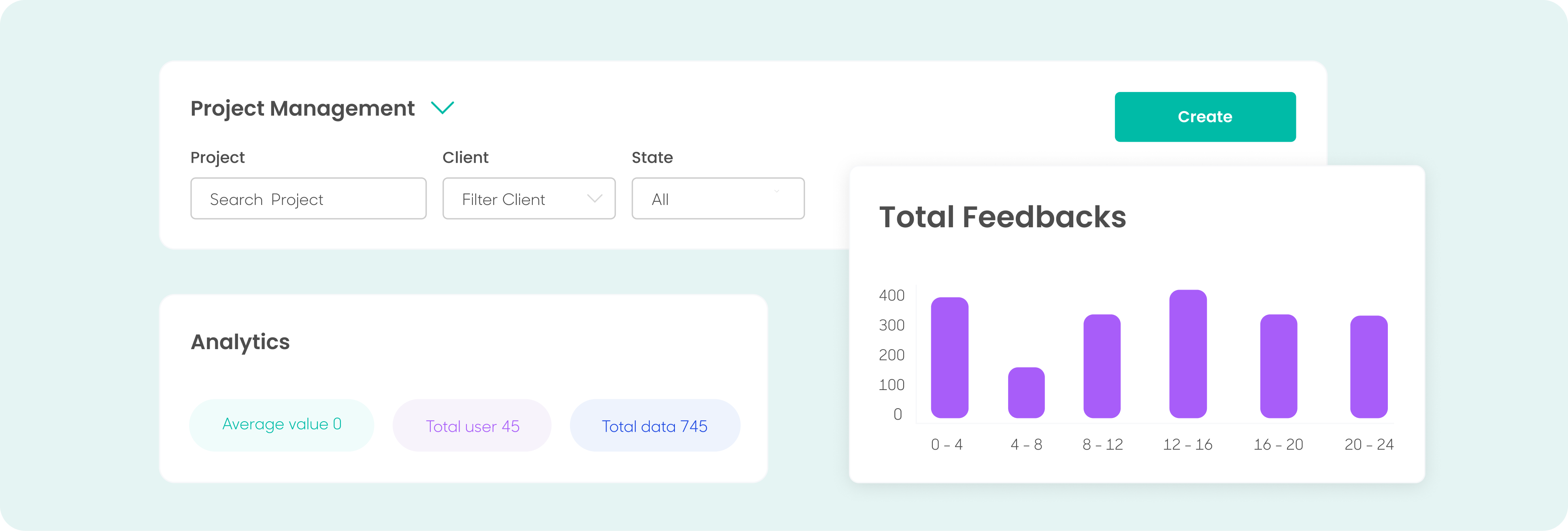
Hello Feedback | UI Components
Onboarding | Usability
Context
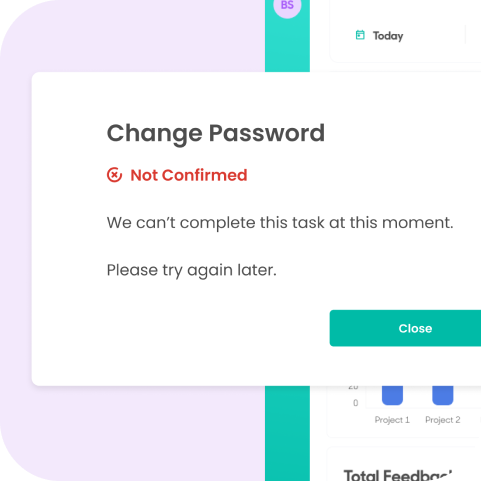
When optimizing the interactions within the platform, one of the concerns was maintaining the clarity in each action conducted by the users The concept of UX onboarding includes several methods that assure transparency and usability are privileged in the design process, carried out through the creation of visual prompts that allow users to receive feedback of the actions that they follow through in the platform.
When optimizing the interactions within the platform, one of the concerns was maintaining the clarity in each action conducted by the users The concept of UX onboarding includes several methods that assure transparency and usability are privileged in the design process, carried out through the creation of visual prompts that allow users to receive feedback of the actions that they follow through in the platform.
UX Onboarding | Empty Slate
UX Onboarding | Pop Up Alert
Data & Results | Feedback
Considerations
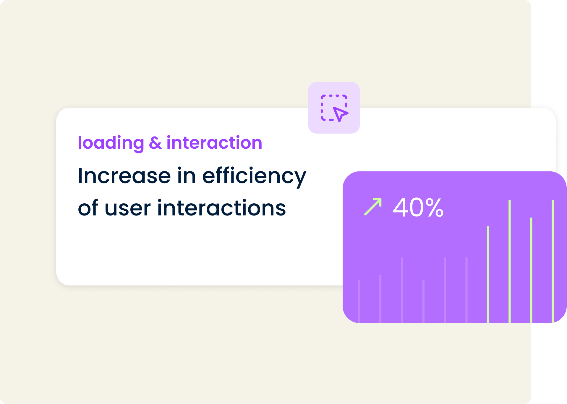
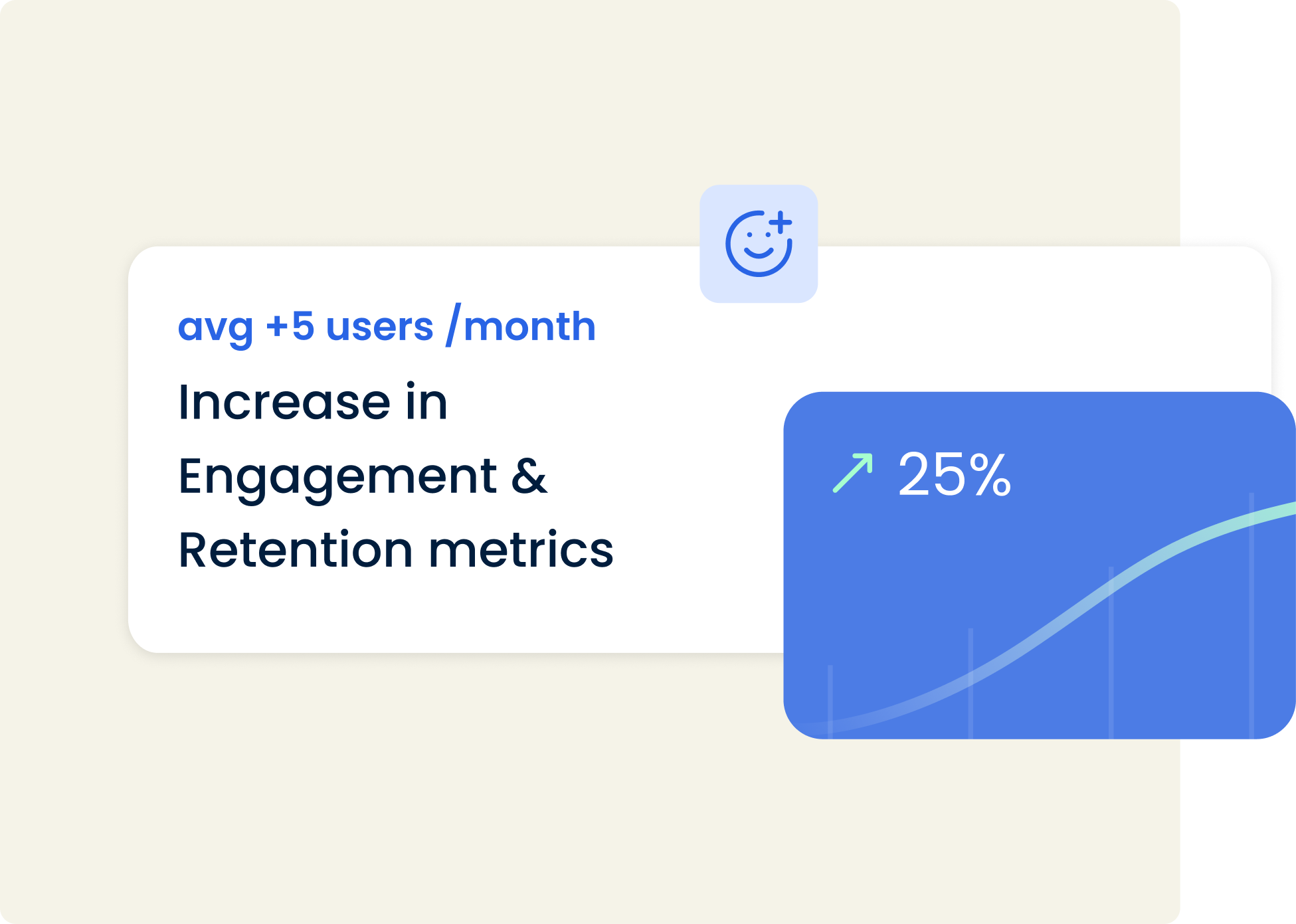
Following the delivery stage of the project, metrics showed an increase in usability, engagement and accessibility. Users feedback also reflected a positive engagement with the product and the developed features.
Following the delivery stage of the project, metrics showed an increase in usability, engagement and accessibility. Users feedback also reflected a positive engagement with the product and the developed features.
